
Here’s a quick overview of the user experience we’ll be creating.
- A user clicks on a trash icon adjacent to the record they want to delete.
- The user is presented with a modal asking them to confirm the deletion.
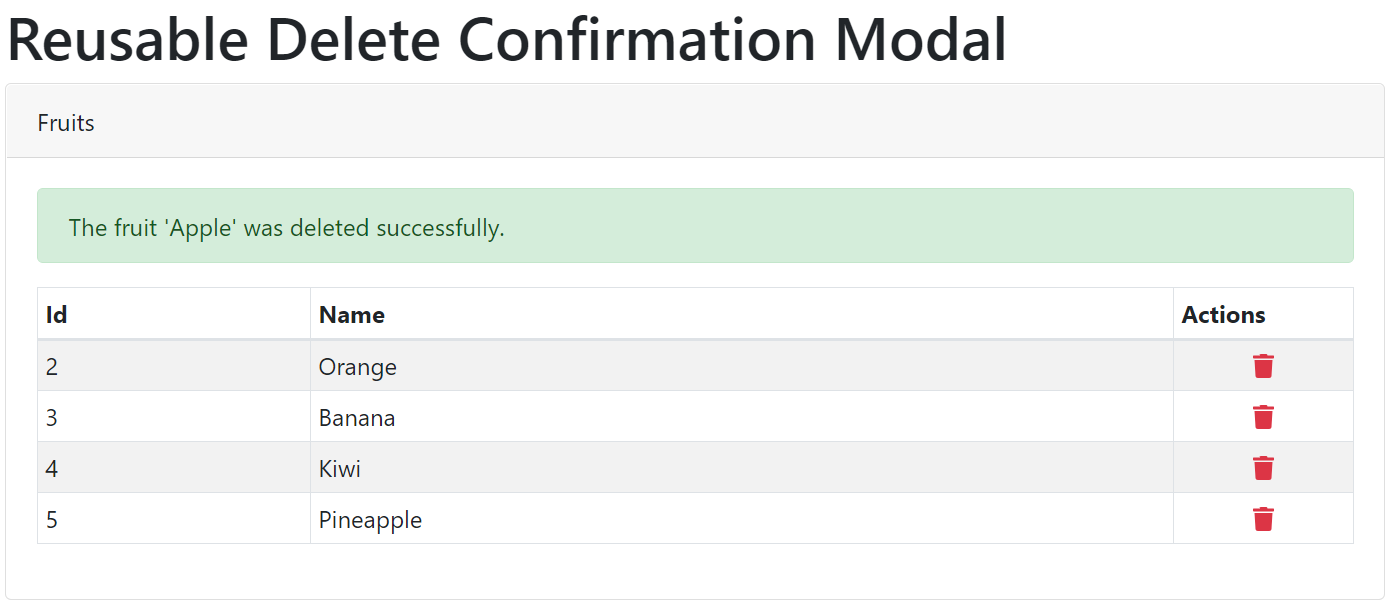
- If the user clicks delete, the deletion is performed and the modal disappears. A success alert is presented to the user.
- If the user clicks cancel, the deletion is cancelled and the modal disappears.
Prerequisites
Although not required, this tutorial implements React Bootstrap and Font Awesome. If you want to match the user interface and component mark-up below, you’ll need to install these two libraries.React Bootstrap
https://react-bootstrap.github.io/
React Font Awesome
https://fontawesome.com/how-to-use/on-the-web/using-with/react
Creating the Reusable React Delete Confirmation Modal
We’ll start by creating our delete confirmation modal component. The goal is to create a reusable React component, which allows us to implement our delete confirmation functionality anywhere in the application. Our new React component requires specific properties that we’ll review in a bit.
First, create a new component in your project called DeleteConfirmation.
|
1 2 3 4 5 6 7 8 9 10 11 12 13 14 15 16 17 18 19 20 21 22 23 |
import React from 'react' import { Modal, Button } from "react-bootstrap"; const DeleteConfirmation = ({ showModal, hideModal, confirmModal, id, type, message }) => { return ( <Modal show={showModal} onHide={hideModal}> <Modal.Header closeButton> <Modal.Title>Delete Confirmation</Modal.Title> </Modal.Header> <Modal.Body><div className="alert alert-danger">{message}</div></Modal.Body> <Modal.Footer> <Button variant="default" onClick={hideModal}> Cancel </Button> <Button variant="danger" onClick={() => confirmModal(type, id) }> Delete </Button> </Modal.Footer> </Modal> ) } export default DeleteConfirmation; |
Here’s what our component looks like in action.
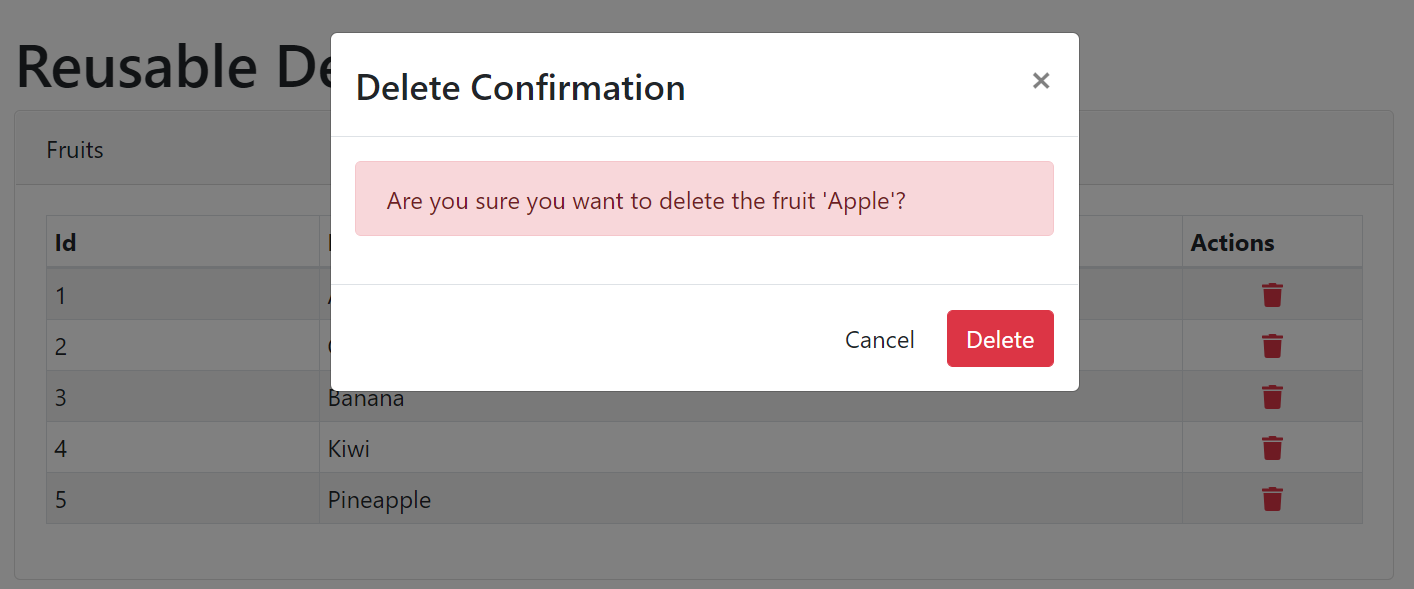
showModalThis Boolean property simply instructs our modal to show or hide itself.hideModalThis property is a function that is passed in from the parent. This function is called when the user cancels their deletion.confirmModalThis property is a function that is passed in from the parent. This function is called when the user confirms their deletion.idThis is the id or key of the record being deleted.typeThis is the type of record being deleted. This property isn’t crucial, but it allows use to the same functions within the parent component. Otherwise, we’d need to create a separate display modal and submit function for each record type. We’d also need to add a DeleteConfirmation component for each list.messageThis is the message displayed within the modal.
Implementing Delete Confirmation In Parent Component
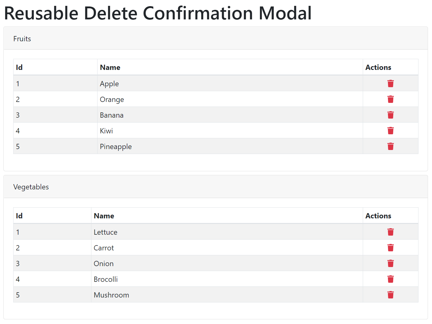
Next, I’ll show you how to implement the DeleteConfirmation component within a parent component. I’m going to implement two separate types of records that share the same confirmation functions. This is why the type property in the DeleteConfirmation component is important.
state of the parent component. In a real-world scenario, I’d expect you’d be pulling data and deleting the record using an API.Here’s what our parent control looks like when displayed within a browser.
Here’s the React code for our parent component.
|
1 2 3 4 5 6 7 8 9 10 11 12 13 14 15 16 17 18 19 20 21 22 23 24 25 26 27 28 29 30 31 32 33 34 35 36 37 38 39 40 41 42 43 44 45 46 47 48 49 50 51 52 53 54 55 56 57 58 59 60 61 62 63 64 65 66 67 68 69 70 71 72 73 74 75 76 77 78 79 80 81 82 83 84 85 86 87 88 89 90 91 92 93 94 95 96 97 98 99 100 101 102 103 104 105 106 107 108 109 110 111 112 113 114 115 116 117 118 119 120 121 122 123 124 125 126 127 128 129 130 131 132 133 134 135 |
import { useState } from "react"; import { Row, Col, Container, Card, Table, Alert } from "react-bootstrap"; import { FontAwesomeIcon } from "@fortawesome/react-fontawesome"; import { faTrash } from "@fortawesome/free-solid-svg-icons"; import DeleteConfirmation from "./shared/DeleteConfirmation"; import "./App.css"; import "bootstrap/dist/css/bootstrap.min.css"; const App = () => { // Set up a list of fruits and vegetables const [fruits, setFruits] = useState([ { id: 1, name: "Apple" }, { id: 2, name: "Orange" }, { id: 3, name: "Banana" }, { id: 4, name: "Kiwi" }, { id: 5, name: "Pineapple" }, ]); const [vegetables, setVegetables] = useState([ { id: 1, name: "Lettuce" }, { id: 2, name: "Carrot" }, { id: 3, name: "Onion" }, { id: 4, name: "Brocolli" }, { id: 5, name: "Mushroom" }, ]); // Set up some additional local state const [type, setType] = useState(null); const [id, setId] = useState(null); const [displayConfirmationModal, setDisplayConfirmationModal] = useState(false); const [deleteMessage, setDeleteMessage] = useState(null); const [fruitMessage, setFruitMessage] = useState(null); const [vegetableMessage, setVegetableMessage] = useState(null); // Handle the displaying of the modal based on type and id const showDeleteModal = (type, id) => { setType(type); setId(id); setFruitMessage(null); setVegetableMessage(null); if (type === "fruit") { setDeleteMessage(`Are you sure you want to delete the fruit '${fruits.find((x) => x.id === id).name}'?`); } else if (type === "vegetable") { setDeleteMessage(`Are you sure you want to delete the vegetable '${vegetables.find((x) => x.id === id).name}'?`); } setDisplayConfirmationModal(true); }; // Hide the modal const hideConfirmationModal = () => { setDisplayConfirmationModal(false); }; // Handle the actual deletion of the item const submitDelete = (type, id) => { if (type === "fruit") { setFruitMessage(`The fruit '${fruits.find((x) => x.id === id).name}' was deleted successfully.`); setFruits(fruits.filter((fruit) => fruit.id !== id)); } else if (type === "vegetable") { setVegetableMessage(`The vegetable '${vegetables.find((x) => x.id === id).name}' was deleted successfully.`); setVegetables(vegetables.filter((vegetable) => vegetable.id !== id)); } setDisplayConfirmationModal(false); }; return ( <Container className="mt-4"> <Row> <Col md={{ span: 10, offset: 1 }}> <h1>Reusable Delete Confirmation Modal</h1> <Card className="mt-2"> <Card.Header>Fruits</Card.Header> <Card.Body> {fruitMessage && <Alert variant="success">{fruitMessage}</Alert>} <Table striped bordered hover size="sm"> <thead> <tr> <th>Id</th> <th>Name</th> <th style={{ width: "120px" }}>Actions</th> </tr> </thead> <tbody> {fruits.map((fruit) => { return ( <tr key={fruit.id}> <td>{fruit.id}</td> <td>{fruit.name}</td> <td className='text-center'> <FontAwesomeIcon icon={faTrash} className="text-danger cursor" onClick={() => showDeleteModal("fruit", fruit.id)} /> </td> </tr> ); })} </tbody> </Table> </Card.Body> </Card> <Card className="mt-2"> <Card.Header>Vegetables</Card.Header> <Card.Body> {vegetableMessage && <Alert variant="success">{vegetableMessage}</Alert>} <Table striped bordered hover size="sm"> <thead> <tr> <th>Id</th> <th>Name</th> <th style={{ width: "120px" }}>Actions</th> </tr> </thead> <tbody> {vegetables.map((vegetable) => { return ( <tr key={vegetable.id}> <td>{vegetable.id}</td> <td>{vegetable.name}</td> <td className='text-center'> <FontAwesomeIcon icon={faTrash} className="text-danger cursor" onClick={() => showDeleteModal("vegetable", vegetable.id)} /> </td> </tr> ); })} </tbody> </Table> </Card.Body> </Card> </Col> </Row> <DeleteConfirmation showModal={displayConfirmationModal} confirmModal={submitDelete} hideModal={hideConfirmationModal} type={type} id={id} message={deleteMessage} /> </Container> ); }; export default App; |
Let’s review the parent component.
- Start by importing the necessary libraries, including React Bootstrap and React Font Awesome.
- Set up the local
statewe’re going to need for our implementation. - Next, create the functions we’re going to use for displaying, hiding, and submitting the deletions. The functions used for setting the modal’s behavior and modifying records will always reside within the parent. Having the logic exist within the parent allows us to customize the functions to reuse our confirmation modal in different cases and for different objects.
- Within the component’s
return, I’m displaying our Fruits and Vegetables lists and wiring up the Font Awesome trash icon next to each item. Upon click, theshowDeleteModalfunction is triggered. - Once triggered, the
showDeleteModalfunction will set the correct message for the selected item and display the Bootstrap modal by settingdisplayConfirmationModalto true.
Once the deletion is completed, we display a success alert above the correct record type.
There You Have It! No More Accidental Deletions
Your React application now ensures users cannot easily, accidentally delete records.
Again, this tutorial was meant to act as high-level guide. Implementation details will most likely differ based on the specifics of your React application.
Josh Greenberg is a developer, partner, and founder at Codemoto based in Boulder, Colorado. I’ve been developing commercial web applications for the last twenty years. With a long history in C#, ASP.NET, MVC, I’ve been mostly focused on full-stack React and .NET Core development for the past few years.


Nice write up. I was curious how to display bootstrap modals in React.
Finally a clearly written, accurate write up. Thanks for taking the time to pass along your knowledge.
React is cool. Thank you for the solid explanation.